My Fave Monday...Distress Ink technique
I'd like to thank Jennifer McGuire for introducing me to Tim Holtz Distress Inks with her Thinking Inking video tutorials I sat glued to on my computer some year or so ago.
Make that two years ago...Holy Crap, was that two years? Now that I'm looking up the video series, I see it has been two years. Time sure flies when you're having fun!
Check them out, if you get a chance, here: http://youtu.be/XjXNnOTAYFA
My fave, this week, is a technique I use and learned from said videos. If only I could come up with this stuff on my own! Taking a plain piece of white card stock and transforming it into a beautiful back round paper to use on cards or scrapbook layouts is just fun to me. And when you can't find patterned paper in your stash to match a project or if you just want more of a water color look, then using Distress Inks is perfect for that effect. The ease of use is pretty much fool proof too. Especially if you find it hard to color in the lines, like me, so to speak, in a metaphorical, yet even literal sort of way.
So, yeah, me and the ever popular, Copic Markers, not so much...just saying.
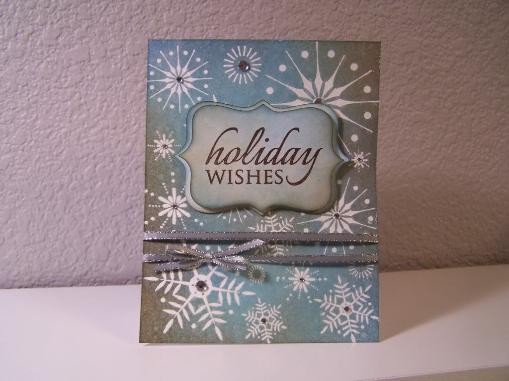
Tonight I made this simple Christmas card using nothing but white card stock (stamped and embossed), ink, a bit of ribbon and some self adhesive rhinestones.
 Choose your ink wisely. No, I'm kidding! The best rule of thumb when it comes to Distress Inks, is to go from light to dark. Not because you have to but because it adds dimension and interest to you your project. Any colors work, just vary them so that they don't get muddy looking.
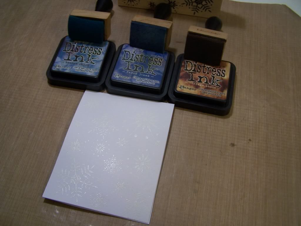
There is this nice little tool that you can buy (see picture above) to help in your blending efforts. It's a wooden handle with a foam pad attachment, but it's totally unnecessary. A make up sponge works just the same. I just happened to fall for the hype when I got sucked into this whole Distress mess. They're handy and an investment if you use them as much as I do, though.
Let's color!
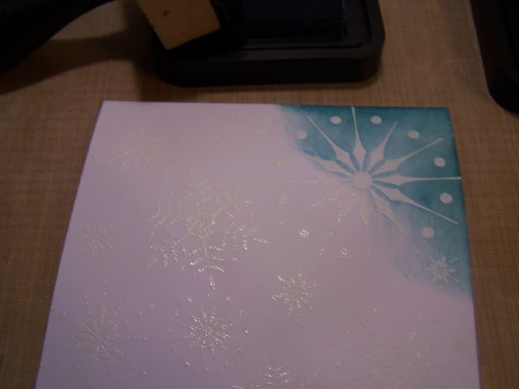 Start with your lightest color first, then pick a spot, apply and blend. Add your next color and keep applying until you get your desired look. Not being much of a planner myself, I never have an idea what a desired look is supposed to look like. I just add color until I think it's cool, then I stop.
 Almost done...
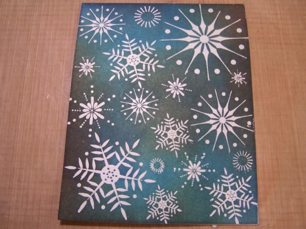 Done. Well, I thought I was done. Then I decided to spray some pearl water onto my newly inked paper for a bit of sparkle.
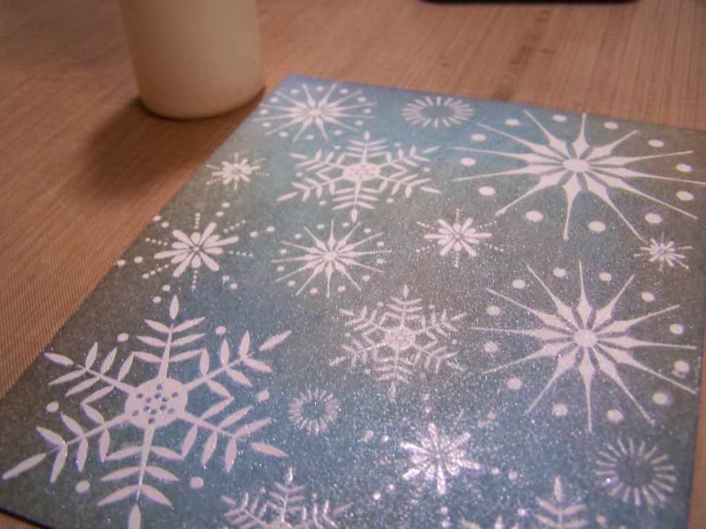 Distress Inks react with water and not only do they blend together more but the color softens. And with the pearl accent it just looks perfect to me. Desired look accomplished!
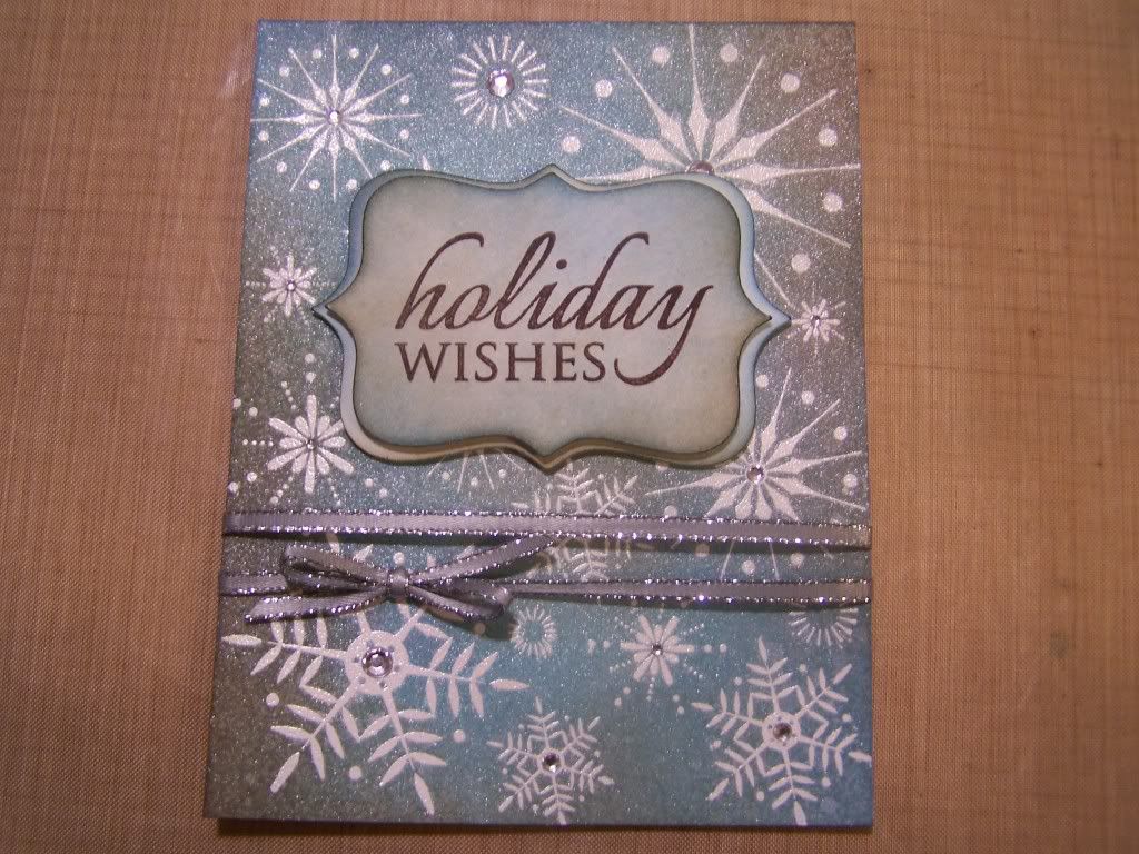
To finish the card, I wrapped slim silver ribbon around the front, tied a bow, stamped a greeting, placed several rhinestones to the snowflakes and called it a day.
Someone in my family will be getting this in the mail, along with school pictures of my kids, for Christmas.
Make that two years ago...Holy Crap, was that two years? Now that I'm looking up the video series, I see it has been two years. Time sure flies when you're having fun!
Check them out, if you get a chance, here: http://youtu.be/XjXNnOTAYFA
My fave, this week, is a technique I use and learned from said videos. If only I could come up with this stuff on my own! Taking a plain piece of white card stock and transforming it into a beautiful back round paper to use on cards or scrapbook layouts is just fun to me. And when you can't find patterned paper in your stash to match a project or if you just want more of a water color look, then using Distress Inks is perfect for that effect. The ease of use is pretty much fool proof too. Especially if you find it hard to color in the lines, like me, so to speak, in a metaphorical, yet even literal sort of way.
So, yeah, me and the ever popular, Copic Markers, not so much...just saying.
Tonight I made this simple Christmas card using nothing but white card stock (stamped and embossed), ink, a bit of ribbon and some self adhesive rhinestones.
There is this nice little tool that you can buy (see picture above) to help in your blending efforts. It's a wooden handle with a foam pad attachment, but it's totally unnecessary. A make up sponge works just the same. I just happened to fall for the hype when I got sucked into this whole Distress mess. They're handy and an investment if you use them as much as I do, though.
Let's color!
To finish the card, I wrapped slim silver ribbon around the front, tied a bow, stamped a greeting, placed several rhinestones to the snowflakes and called it a day.
Someone in my family will be getting this in the mail, along with school pictures of my kids, for Christmas.


SO pretty Adelle!
ReplyDeleteThanks Misty :-)
ReplyDeleteBeautiful card and lively post!
ReplyDeleteI appreciate that so much! Thank you :-)
ReplyDeleteVery Pretty Card! I had to pin it on Pinterest :D
ReplyDeleteThank You, so much, Julie! :)
ReplyDelete